Product Card
A simple, responsive product card component with image, pricing, and action, built with React, TypeScript, and Tailwind CSS.
Product Card
A clean, minimal product card component built with React, TypeScript, and Tailwind CSS. Modeled after standard e-commerce grids, it keeps image, name, description, and price aligned in a consistent vertical layout, with a single call-to-action that stays legible at any card width.
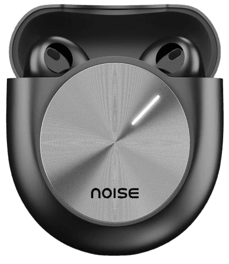
Noise-cancelling, 30hr battery
Hot-swappable switches, RGB backlit
Heart rate + sleep tracking, 7-day battery
Waterproof IPX7, 12hr playtime
Auto-focus, built-in ring light
HDMI, SD card, 100W passthrough
Key features
1. Fixed-ratio image container
The product image sits in a 1:1 aspect-ratio box using fill, so every card in a grid stays visually aligned regardless of the source image's native dimensions — no stretching, no layout shift while images load.
2. Truncated description
Longer descriptions clip cleanly at two lines instead of pushing the card's height around, keeping every card in a grid the same size even when copy length varies between products.
3. Prop-driven, fully reusable
Name, description, price, and image are all props — no hardcoded content — so the same component renders any product by passing different data, whether from a static array, CMS, or API response.
4. Responsive grid-ready
Built with no fixed width beyond max-w-xs, so it drops cleanly into a grid-cols-2, grid-cols-3, or grid-cols-4 layout and resizes with its container at any breakpoint.
5. Composable by design
Ships as a single self-contained component with one clear action (add to cart), so it can be dropped into a landing page, a shop grid, or a cart summary without extra wiring.